Archive for July, 2006

TELLOS related…

telloshc.jpg

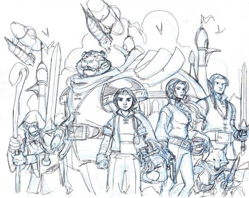
This is a sketch/idea for something TELLOS related on the horizon. Let me say right up front that it’s not a new mini series (yet). I’ve been debating with myself about giving out ‘teases’ for something that’s months from happening and might be
misinterpreted as a new TELLOS story. Todd and I ARE talking out a new TELLOS tale. We’re also talking about the format– it could be a mini, or it could be an original graphic novel (OGN). But that will be something for the future– although hopefully not TOO far in the future. This sketch is for something else entirely– and it might not end up being used for that project. It’s just a first sketch.

I’ll leave it to anyone who cares to speculate as to what it might be. I’m sure there will be an announcement about it in the next few months. Keep watching this space for details……

OK… enough babbling/teasing.

This is Entry 259.

Mike

The portfolio piece that WASN’T


This is the first sketch I did for the piece that I did for the HEROES CON portfolio. Initially, I wanted to do this BLACK CAT piece with the uplit cityscape in the background. I was hoping to have something sexy and dramatic to offer for the portfolio. The problem was, when I started tracing the layout up, although I thought it looked fine in the initial sketch– the pre-ink pencils looked awful. BC’s back looked positively broken. I just couldn’t make the front of her body match up with the back part. It looked like the two parts of her body were cut in half and reattached in the wrong position.

Funny thing is, some times I look at this sketch and it looks fine. Some times, it looks completely wrong. Whatever the case– I ended up doing the FANTASTIC FOUR piece that ultimately ended up as the final portfolio illustration.

Have a great weekend, all.

This is Entry 258.

Mike

MONSTER

monster.jpg

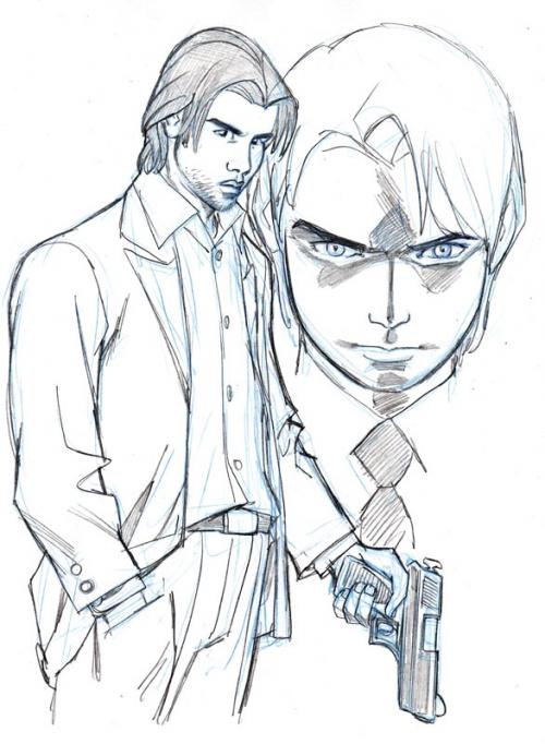
Anyone else reading this manga? I’ve been buying a lot more translated Japanese comics lately– and MONSTER, published by VIZ, is one of them. MONSTER is about a brilliant young Japanese surgeon, named Kenzo Tenma, living in Germany. He gets caught up in a search for a serial killer years after a horrific event in which a surviving pair of siblings– one boy and one girl– are brought to his hospital in the wake of a terrible murder of their parents. The sister is in shock– and the brother has been shot in the head. Tenma operates on the boy, and saves his life. This begins a dark mystery that entangles the doctor in a hunt for a cold serial killer that Kenzo feels compelled to hunt down. I’m not going to go into the hows and whys of this, because I don’t want to spoil anything for anyone who might not have read this great manga but might be interested in doing so.

I have really been enjoying MONSTER. There have been 3 volumes released so far, and it’s supposed to be 18 volumes long… so I’m looking forward to a lot of creepy intrigue and murder over the length of this story. There’s some odd quirks that come with most manga– such as the length of some scenes and the tendency for manga stories to read a bit odd as far as dialogue goes. I don’t think it’s the translation– I think it’s the cultural difference in the way manga is written. But that’s a small thing. The thing that strikes me most odd about MONSTER is that the main character, Kenzo Tenma, looks about as Japanese as I do. I’ve drawn him looking much more Japanese in my sketch here than he looks in this book. That’s also something I became quickly used to… but it’s still kind of odd. I’d love to hear Naoki Urasawa’s (the author/artist) reasons for this. Perhaps this is something culturally unique to manga as well.

Bottom line, though– MONSTER is a dark and fascinating story. Check it out if you’re into stuff like SILENCE OF THE LAMBS.

This is 257.

Mike
BODY IMAGE

figures.jpg

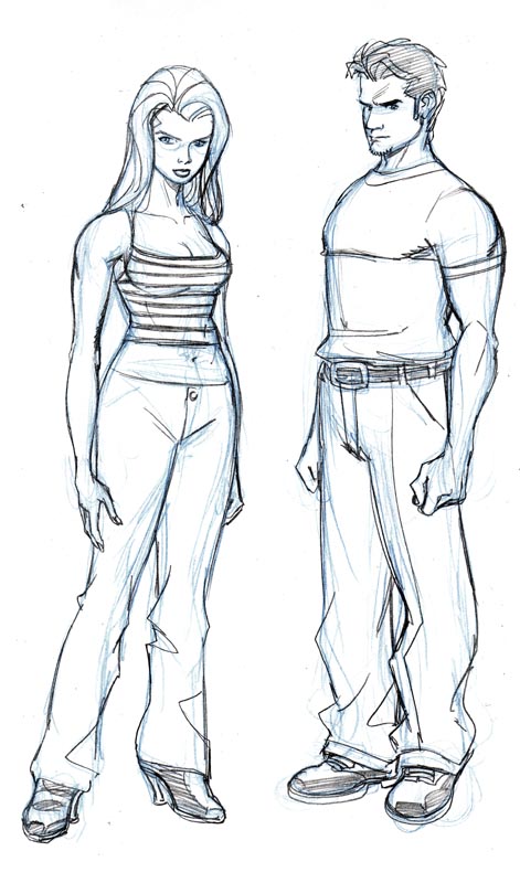
Today over in my FORUM, someone started a thread with the observation that unlike a lot of comic book artists these days, the characters I draw have longer torsos and shorter legs than the other way around. J. Scott Campbell’s work was used as the primary example of an artist who draws his characters with super-long legs and very short torsos. I love the way Campbell draws his figures… they’re entirely distinctive and charming. I don’t know why I, myself, have usually tended to draw figures with longer bodies and shorter legs. I remember at one point when I was working on ADVENTURES OF SUPERMAN, someone made an observation on some forum or other that the trend had gotten to the point where it was ridiculous. I’ll admit that was, indeed, true. I don’t know why– but I had started to draw characters (especially the males) with super-short calves. I think in terms of aesthetics and depicting motion/movement, longer limbs are probably more effective.

Today’s sketch is an attempt at playing with those types of longer limbed characters. I’ll admit, it felt very unnatural to draw them like this…. but I can see that they look more graceful like this. I don’t know– I might keep pushing this and see where it goes.

This is Entry 256.

Mike

POWER GIRL

ringopowergirl.jpg

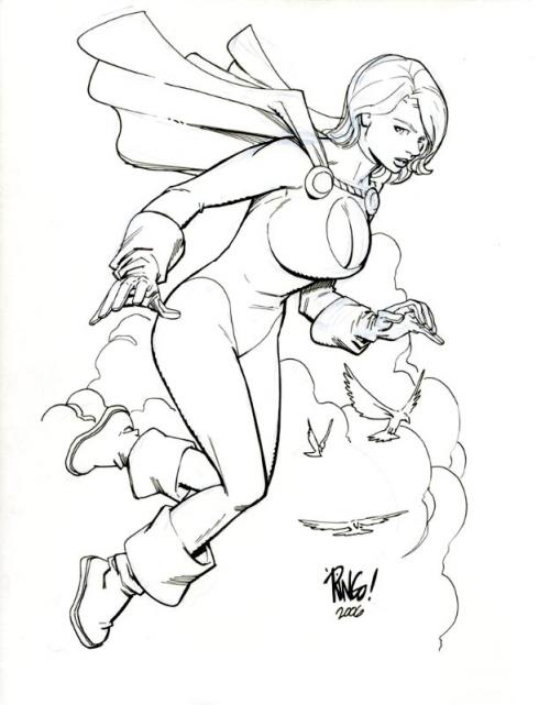
Well, I’ve just about milked the images that I did before and during HEROES CON dry. I found this POWER GIRL sketch I did as a commission during the show over on COMICARTFANS.COM. I kind of struggled with this one. I’m not one of those guys who is wont to draw excessive size on a female character’s chest– but POWER GIRL is always portrayed in that manner, so I figured I’d better go with it.

Still nothing earth-shattering news wise out of COMICON INTERNATIONAL in San Diego so far– but it’s only been a couple of days including Preview Night, so there’s still hope for hearing something fun. By every account I’ve read so far, the show has grown to the point where it’s almost overwhelming for most folks anymore. My last trip to the show was in 2000 in the futile GORILLA COMICS tour of shows to promote our line of comics that… unfortunately… never really took off. It was amazingly huge even then. Compared to my earliest experiences with COMICON in the early 90’s, it was amazing to see…. I can only imagine what it must be like now. I DO think that if you’ve got an independent project, COMICON INTERNATIONAL would be a fantastic place to promote it. Where else are you going to have the potential to expose your work to at least 100.000 people in one place….? This year, it’s estimated that that attendance record that COMICON set last year will be utterly shattered.

Truly amazing.

That’s it for today– have a great weekend.

This is Entry 255.

Mike