SPIDER-HAM

⊆ December 21st, 2005 by ringo | ˜ Comments Off on SPIDER-HAM

peterporker.jpg

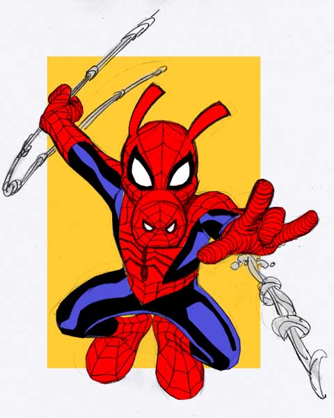
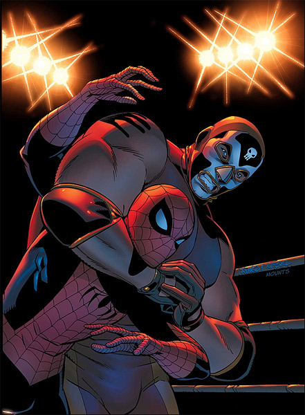
Marvel has released the images for the next two variant SPIDER-MAN covers (which I’ve also posted here below)– and have announced that they’ll be taking a poll as to which variation of SPIDER-MAN’S costume that folks would like to see on the last two variants. I’m still unclear as to whether retailers or fans will be making the ultimate decision…. but as for the FANS choice, it clearly seems to be PETER PORKER, THE SPECTACULAR SPIDER-HAM. IF Marvel ends up going with SPIDER-HAM, I really think it would be only fitting that the original SH artist, Joe Albelo, be allowed to draw that version. It would be a hoot to see him draw the SPIDER-HAM version in his great style…. complete with his versions of DOC OCK’S tentacles and GOBLIN’S pumpkin bombs. I thought I’d do my version of SPIDER-HAM here, though, just for fun.

Here are the SPIDER-MAN 2099 and WRESTLER PETER PARKER covers that were just released:

This is Entry 175.

Mike


The BIG SHOW…

⊆ December 19th, 2005 by ringo | ˜ Comments Off on The BIG SHOW…

printerlove.jpg

When I first moved to North Carolina to join what became ARTAMUS STUDIOS, along with such talented folks as Richard Case, Jeff Parker, Chuck Wojtkiewicz, John Lowe and several others (we had a pretty packed house for a while there…! It was a wonderfully creative atmosphere…) one of the first things we did was to buy a copy machine. We were commissioned, as a studio, to do a fill in issue for one of the then burgeoning MALIBU COMICS’ ULTRAVERSE titles called HARDCASE. The book had fallen critically behind, and we were tasked with producing the entirety of the interiors for, I think, the third issue, in ONE WEEK. Layouts, pencils and inks. We completed the task within the given timeframe….. and though it’s not a job that any of us were particularly proud of, the money it brought in enabled us to purchase a large copy machine for our newly born studio– as well as a fax machine and several phones. So we were set up to communicate with our various clients with the fax and phones…. and more importantly– to those of us who worked in this manner– we were now able to make enlarged copies of our layouts for tracing onto the art board the comics companies provided for us. I worked in this manner…. and still do to this day.

Eventually everyone moved on from the studio. Several of our number went out west. Some left the comics industry altogether. But always, there was the copy machine still sitting at ARTAMUS STUDIOS. Until, at the end, when it was just Rich Case and myself… and Rich decided that moving to the video game industry was more stable for him and his family than freelancing in comics (and who can blame him…. he’s right). And so, the studio was finished. But there was still the good old copy machine. That came home with me, since I’m still working in comics, and still working in basically the same manner. The thing is, though– this April will make three years (ALREADY!) that I’ve been working here in my abode…. we purchased the loyal copier back in 1993– it will be almost 13 years old by then. Even though we never used it nearly as much as a ‘real’ office would have, time takes its toll on all mechanical things, regardless of how well kept they are. Over the past couple of years, I’ve had to have a technician come out to service the old fella several times, and it’s never inexpensive. Frankly, it’s slowly breaking down.

And so I decided that I’d become a bit more modern, and buy a printer that prints on 11 X 17 inch paper for making my enlargements. I’d often have to make several tries at getting the copy just the right size with the old copy machine… and with this new method, by sizing the layout in Photoshop on a template, I can get it right the very first time. It’s much more convenient… and I like staying current and using technology to my advantage whenever possible. And so the new large format printer has joined my family of other computer peripherals… the smaller, 3-in-1 printer/scanner/fax machine (does anyone actually ever FAX anything anymore…?) and my large flat-bed scanner. I’m pretty much ready for anything I need to do.

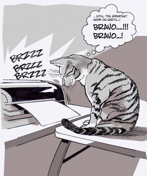
And every time I print out ANYTHING…. whether it’s on the large or the small printer…. it instantly transfixes Charlie. The second he hears the printer starting, he’ll stop whatever he happens to be doing, and jump up on the table to watch the paper print out. It seems to mesmerize him…. and I can’t distract him from watching it no matter what I try. It’s hilarious. And it never seems to get old for him. You’d think that after so many times (I’ve had the smaller printer for many months now) that it MIGHT start to get old for him… but no.

And frankly, I hope it never does.

This is Entry 174.

Mike


Pleasant surprises…

⊆ December 16th, 2005 by ringo | ˜ Comments Off on Pleasant surprises…

lilwolvie.jpg

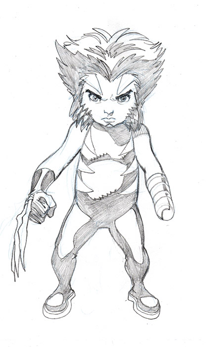
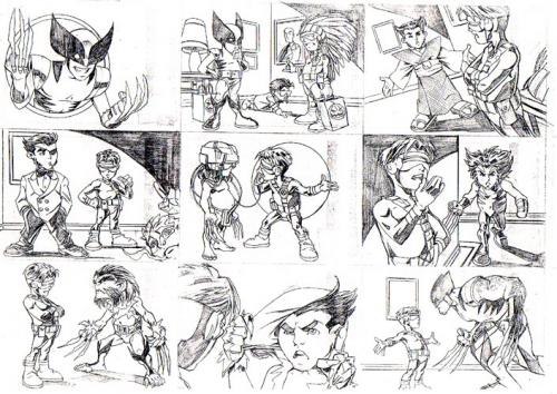
The other day I got an email from Dan Slott. Dan writes the delightful SHE-HULK series, as well as the new THING series at Marvel. He was writing to thank me for drawing the FLAT-MAN ACTION FIGURE page in the GREAT LAKES AVENGERS X-MAS SPECIAL that came out recently. It very nice to hear from Dan– although it was entirely unnecessary for him to thank me…. the page was a lot of fun to do. But in that email, he mentioned that we had worked together on two one-page items at this point, and that he’d like to work together on something a little longer (I’d like that as well….!). He related the OTHER thing we’d done together; another very fun little job. Several years back, I was asked to draw a nine-panel story that would be used on the back of a subset of WOLVERINE cards from Fleer. It involved LIL’ WOLVERINE trying to decide which of his many incarnations would be the best one to dress as for Halloween. It was a ton of fun to draw… and until getting that email from Dan, I’d either FORGOTTEN that he’d written it, or never knew in the first place. It was a pleasant ‘blast from the past’, and prompted me to go back and pull the only xerox copy of it I still have and offer it here. I don’t know how many have seen these cards…. so here ya go:

lilwolviecards.jpg

Anyone who is NOT reading SHE-HULK … well, you SHOULD be. It’s an amazing comic. Dan does a wonderful job of writing a truly intelligent, witty and fun book– and he also is great at mixing character development with a healthy dose of action. He keeps things moving at all times, and that’s one of the things that makes comics so interesting for me. Unlike so many of the books written today, Dan never lingers on any one scene for too long….. his characters move from place to place and that’s something that’s not only fun to READ, but it’s got to be fun to draw as well. And Juan Bobillo does a brilliant job of drawing Dan’s great, quirky stories. Do yourself a favor and buy this book. It’s one of MY favorites, and it deserves your support.

That’s it for today.

This is Entry 173.

Mike


Big Sky

⊆ December 14th, 2005 by ringo | ˜ Comments Off on Big Sky

hi-lo.jpg

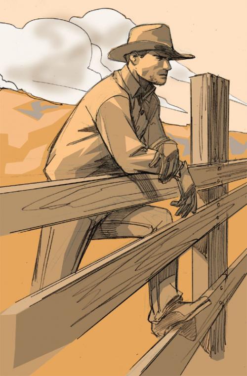
I did this sketch quickly last night while watching a movie called THE HI-LO COUNTRY on the Independent Film Channel. I love IFC, because they’re constantly showing movies that I have never gotten a chance to see– or in the case of last night’s film, I’d never even known it existed. HI-LO is a western– but set in the WW II era. The stars of the film include Woody Harrelson, Billy Crudup, Patricia Arquette, Penelope Cruz and Sam Elliot. I’m a huge fan of the western genre, and I was very excited when I stumbled across this film. I was at first kind of disappointed when I realized it was a relatively modern-day tale…. but the incidental props like cars and 40’s-era guns didn’t change the basic tenor of the film…… it was still a pure western. I suppose I like well-done westerns (movies, novels or comics, it doesn’t matter) because the fact that these tales are set against the stark, rugged landscape of the west and shines a spotlight on the physical, emotional and spiritual struggles of the players. THE HI-LO COUNTRY is suffused with the themes of friendship, love and loyalty juxtaposed against betrayal, jealousy and greed. The movie’s got a few flaws here and there… but the acting is genuine and the story was very compelling.

There’s an italian western comic called TEX that is enormously popular throughout Europe. It’s been published continuously for some 40-plus years since its creation. I think that Europeans are fascinated with the American west because of that very open, rugged, untamed landscape that is so much a part of our history and culture. It’s possible that the new spate of western comics that are popping up here in the States will do pretty well over there– in particular the new title LOVELESS from DC/Vertigo. It’s a very dark, hard edged and immensely violent look at the immediate aftermath of the end of the Civil War. The artwork is brilliantly done by Marcello Frusin. He’s been a favorite of mine since I first saw his work. He’s a former studio mate of Eduardo Risso, and his work has that same wonderful use of heavy black that Risso’s does– but Frusin’s drawing is much more naturalistic… less stylized. If you’re at all into the western genre, you should check it out.

Artwork from issue #3 of FRIENDLY NEIGHBORHOOD SPIDER-MAN is now up in my section on the MOTHCOMIX web site. Just follow the SALES links at the top of the page to see the items up for sale. And the double-page spread from the end of the issue with IRON MAN carrying Peter’s dead body is up on eBay now.

UDATE: Today Marvel released the solicitation copy and cover images for the March titles…. so I thought I’d post the cover image to FRIENDLY #6 here:

spiderman.jpg

That it today.

This is Entry 172.

Mike


SERRA’S clothes

⊆ December 12th, 2005 by ringo | ˜ Comments Off on SERRA’S clothes

serra.jpg

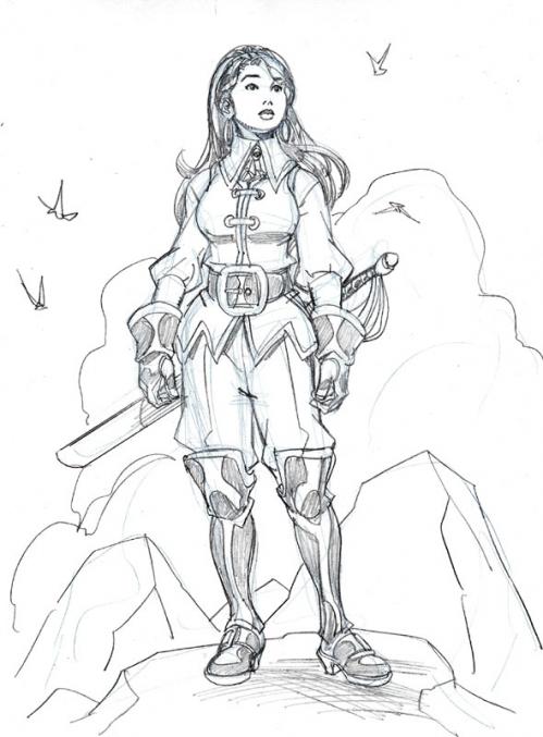
Anyone who has seen the first couple of issues of TELLOS– and in particular, the DYNAMIC FORCES variant cover to the first issue– knows that the SERRA character is showing a TON of…. cleavage. In fact, she’s wearing a top that is totally unbuttoned (or unclasped) and tied at the waist. She’s barely covering herself with that look in those first couple of issues. I don’t know what I was thinking at the time– but what I was probably trying to do was to appeal to the part of the market that loves their comic book women wearing as little as possible. It was more than likely an attempt to give SERRA that ‘bad girl’ scantily-clad look that so many adolescent (and full adult, it seems) male readers like. Pandering, is what it was– pure and simple. But something happened that made me change SERRA’S ‘look’ as soon as I was able. Todd and I attended a show (I can’t remember which one it is after all this time) after the first issue or two had shipped. The book was coming out bi-monthly, and so I was just starting issue 3 when we went to that first show after TELLOS started coming out. Instead of the expected wave of young men drooling over SERRA’S frontage (although there were many of THEM), I was seeing lots of parents bringing their daughters and/or sons up to our table to tell Todd and me how much they AND their children loved TELLOS. Over and over I heard how happy they were that there was a comic out there that they could read together; something that was fun and exciting that they could enjoy as parents, but their kids could enjoy as well. I kept expecting SOMEONE to add “….But it would be even better if the SERRA character wasn’t showing so much cleavage….!” But that never came.

And yet, seeing all those smiling parents and their beaming kids, that cleavage was all I could think about. I felt personally mortified that I had clothed SERRA in so little and that there were so many kids seeing her like that. I started to feel as though I’d done the character — and all these families who were reading about her–an injustice. And so at the first opportunity– which just happened to come in that third issue I was still working on– I worked in a clothing change for SERRA. I gave her a frilly collar that went all the way up to the top of her neck, emanating from a vest that covered her up nicely. To be honest, I loved the new look immediately. And I’d like to think that if SERRA could speak to me, she’d thank me for giving her an outfit that was, frankly, more sensible for the pirate captain on the go, fighting for her life and her world.

Today’s sketch is another design for her. I’ve been, as I said in a previous post, been thinking about the characters a lot lately… and I wanted to play with SERRA’S look again.

In a sensible way, of course.

This is entry 171.

Mike