SIZE MATTERS

⊆ November 14th, 2005 by ringo | ˜ Comments Off on SIZE MATTERS

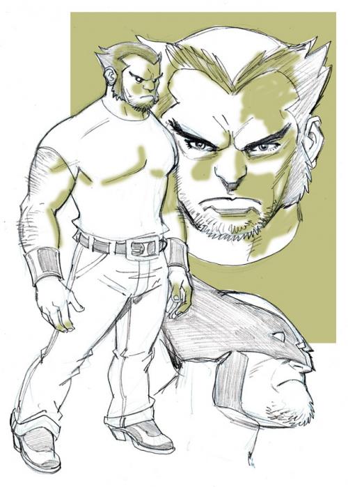
wolverine.jpg

In the issue of FRIENDLY NEIGHBORHOOD SPIDER-MAN I’m working on now, I have a very brief scene in which Logan/Wolverine appears. As usual, even when I’m drawing a character that’s only in one scene…. and sometimes only in one PANEL– I wanted to do a brief sketch to get a feel for him. I’ve drawn LOGAN before– most notably in the X-MEN 1/2 that Todd Dezago and I produced for WIZARD and MARVEL years back (which led us to the realization that we wanted to continue with the fun fantasy-themed type of comics…. and thus TELLOS was born). But it’s been a while– and so I wanted to refresh my ‘drawing memory’. I’ve noticed that over the years… ESPECIALLY since the X-MEN movies have come out… that people are drawing LOGAN much taller and less stocky than he was when he was originally created. He’s always been much shorter than the normal human being… and very thickly muscled. In fact, I can remember– especially during the Claremont/Byrne days of UNCANNY X-MEN– that people often referred to LOGAN as ‘shrimp’, ‘shorty’ and ‘midget’. But since the not-so-short Hugh Jackman played the character, he’s been portrayed more like his movie version than the original comic book version. I think I’ll stick with the short and stocky version for my scene….. although since he’s seated the whole time, it won’t matter much anyway.

The same ‘syndrome’, if you will, has happened to Ben Grimm/THE THING over the years as well. When the FANTASTIC FOUR comic book first began, Ben was actually a tad SHORTER than the rest of the cast. At least, he was shorter than Reed. And when I first started drawing FF myself, I actually started off making him smaller than he had been portrayed in recent years. But as is often the case with me, I read one too many message board posts discussing how ‘wimpy’ I made him look– and I guess I was subconsciously influenced by those comments (I KNOW I was now, looking back… but I don’t think I knew it then)– because as time went on, I made Ben more and more huge and hulking. Go back and check the difference between his appearance in issue #60, and his appearance in issue– say– #520 (back to the original numbering…. I didn’t work on the comic THAT long….). There’s a big change.

OK… that’s it for today.

This is Entry 161.

Mike

One to carry you into the weekend….

⊆ November 11th, 2005 by ringo | ˜ Comments Off on One to carry you into the weekend….

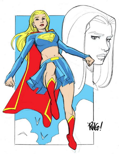
supergirl.jpg

I just wanted to post a quick sketch of SUPERGIRL I did as a warm-up the other day– and I threw some quick flat colors on it for added measure.

So FRIENDLY NEIGHBORHOOD SPIDER-MAN #2 came out this past Wednesday…. did anyone buy it? What did you think?

Over at NEWSARAMA the OCTOBER 2005 sales chart for comics released that month is up. FRIENDLY #1 was #5 in ranking…. which is the highest ranking for ANY comic book I’ve ever worked on. Of course, the book being a first issue of a brand new SPIDER-MAN title– and being the lead-in/launch point for a major crossover event running through all the SPIDER-MAN titles was the major contributing factor. No matter what your views on these crossover stunts (personally, I don’t like them at all)– you can’t argue with the results in sales. AS LONG as retailers continue to order them in large numbers, and fans continue to buy them in equal numbers… the companies will continue to produce them. But as far as the ranking of the book– this level is a milestone for me.

This is Entry 160.

Mike


ATLAS comics

⊆ November 9th, 2005 by ringo | ˜ Comments Off on ATLAS comics

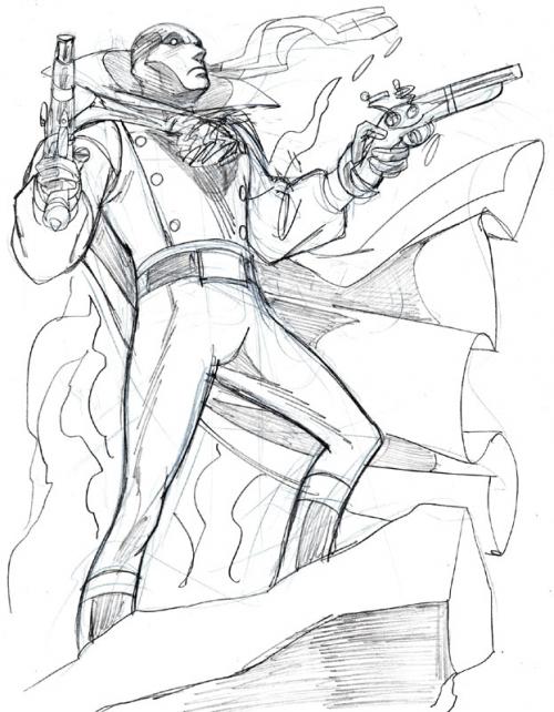
grimghost.jpg

Anybody remember the ATLAS line of comics from the mid-70’s…? It was a line of books started by Martin Goodman, the former publisher of MARVEL Comics from that era. It was a bold thing for him to do at the time with the stranglehold that Marvel and DC had on newsstand distribution in those days (not DISSIMILAR to the situation the comics industry is in THESE days, only with direct sales. Funny how history tends to repeat itself)– and he enlisted the talents of some of the greatest names in the industry like Neal Adams, Steve Ditko, Howard Chaykin, Ernie Colon, Pablo Marcos and Rich Buckler. They had a fun, diverse line of mainstream oriented titles like DESTRUCTOR, THE COUGAR, PHOENIX, IRON JAW, MANHUNTER, TIGER-MAN, PLANET OF THE VAMPIRES…. and my absolute favorite, THE GRIM GHOST. THE GRIM GHOST is the story, set in colonial America, of an infamous highwayman named Matthew Dunsinane who is captured and executed for his crimes. His soul is relegated to Hell, where Satan gives him the choice of burning there for all eternity, or returning to the mortal world as a vengeful spirit, tasked with harvesting evil souls for Hell. Dunsinane chooses to return to our world and carry out Satan’s request. Not only was the book incredibly illustrated by the brilliant Ernie Colon– but the premise and stories were well crafted. It was sort of a precursor to SPAWN. I’d love to find out of these characters are owned by anyone or if they’re public domain. It would be great, in either case, if they were to see publication again with some new adventures.


THE VIEW FROM MY BACK YARD.

The weather we’re having here right now is nothing short of gorgeous. The leaves are brightly colored and just beginning to fall….. and the temperatures are at almost 80 degrees….! I love my neighborhood and my home…. it’s very quiet here, and there’s lots of trees still around– even though housing developers are doing their best to build on every square foot they can find not already in use. I know that this weather won’t hold… in fact, the forcasters say this is the last day we’ll have of these temps this week… maybe this season. So, like everything good, it’s got to come to an end. But it certainly is wonderful being able to leave the sliding glass door to the screened in back porch open all day even almost half-way into November.

This is Entry 159.

Mike


Weekend sketching

⊆ November 7th, 2005 by ringo | ˜ Comments Off on Weekend sketching

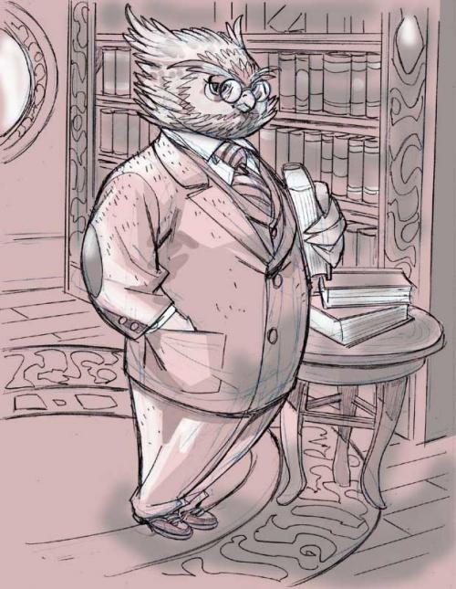
professorowlcolor.jpg

I felt like doing something…. playful… as a way to unwind this past weekend. The subject matter I’ve been dealing with has been so heavy and dark lately that I wanted to do something a little more on the lyrical side. As I’ve stated ad nauseum, I’m very partial to fantasy as well as anthropomorphic characters. So I thought it would be fun to do a sketch with both those aspects in mind. Looking at the piece now, it looks like the owl professor might be a LITTLE off balance. He’s sort of tipping forward just a bit– but hey, owls can fly, so maybe he can lean any which way he chooses and not lose his balance completely.

At least, I’d like to think so.

This is Entry 158.

Mike


LIONS, TIGERS AND BEARS

⊆ November 3rd, 2005 by ringo | ˜ Comments Off on LIONS, TIGERS AND BEARS

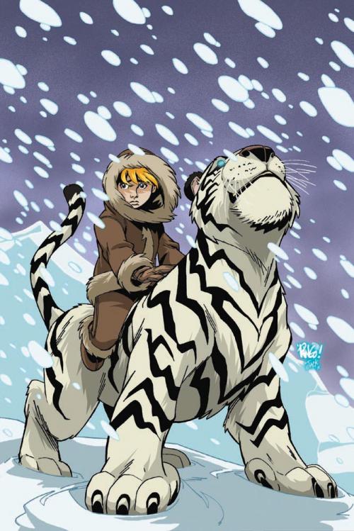
ltbv2_01fcb-copy.jpg

Here’s another example of why I love the internet so very much. Some time ago, I saw some news articles on the various comics news sites about a new comic called LIONS, TIGERS AND BEARS coming from IMAGE that was being done by a couple of guys named Mike Bullock (writer) and Jack Lawrence(artist). I was very familiar with Jack’s work on a book he had created a while back called DARKHAM VALE. The first time I saw Jack’s work, I connected to it. His stuff’s got that open, vibrant , full-of-character kind of feel that I really enjoy in the more ‘cartoony’ kinds of work done in comics. There’s a charm to his drawing that just grabs me. And DARKHAM VALE was a wonderful dark fantasy/coming of age story that I enjoy so much– and the kind of thing that’s perfect for readers of all ages. There’s a sense of wonder and the fantastic in tales like DV and LTB that is sorely lacking in today’s comics. I don’t know if it’s because the folks writing most of the output from the ‘Big Two’ are jaded and cynical, or that they’ve grown OUT of their sense of imagination–but that imagination is missing from comics from the ‘majors’ these days. Now Jack is teaming up with Mike Bullock on LIONS, TIGERS AND BEARS, a book that has some of those same themes of discovery and magic and wonder that I enjoy so much.

And so I posted on the IMAGE message boards, telling them how much I was looking forward to seeing LIONS, TIGERS AND BEARS debut…. and wouldn’t you know it– in much the same situation as I described with the WONDERCITY folks a while back, Mike Bullock contacted me about sending me a preview-look at the full first issue and asking for a quote for the book. And thus, another interweb creative relationship was born. It’s happening all over these days, and it’s a beautiful thing. And now, just recently, Mike and Jack asked me to contribute a cover for the first issue of their NEW LTB volume… and I was more than thrilled to do so. That’s the image you see above….. gloriously colored by Jack Lawrence himself over in Jolly Old England. VIVA LA INTERNET…!!!! I’m not going to try to describe the story behind LTB, because I want you– if you’re not ALREADY familiar with this wonderful book– to go check out some information about IT and many other wonderful creations from the fertile minds and hands of these and other folks over at the RUNMASTER STUDIOS web site. It’s all about imagination and wonder over there. So do yourself a favor– go see what they have to show you, read all about it…. and then go seek out LIONS, TIGERS AND BEARS. They’ve got a trade out of the first mini series– so you can catch up on what you’ve been missing.

I know I’ll be first in line to get the first issue of the NEW mini when it hits.

This is Entry 157.

Mike