Archive for April, 2005

FRIENDLY NEIGHBORHOOD Spider-Man

The last few days have been a real thrill– watching the comments pile up and realizing how many folks were pouring in to weigh in with their opinions. And checking my daily stats software, the individual visits have just SKYROCKETED over this whole thing. I hope people will continue to stop by and check out the blog offerings, even after all the ‘radioactivity’ over this subject has died down. This blog has become a lot of fun for me, and very special to me as well– and I enjoy the idea of sharing it with as many folks as possible. From a PERSONAL standpoint– as far as my depiction of Spider-Man goes– I’m just going to let it happen organically. I’m going to let flow from my pencil what will, and I think that’ll be the best way to handle it. I’m not going to force anything one way or another. I’ll be the most satisfied by NOT forcing it. Watching everything unfold the last few days has really shown me the power that SPIDER-MAN still holds in the hearts of his fans. I think that all the recent discussion ends up underlining that it’s not the artist, or the style that artist uses– it’s the power of the CHARACTER. SPIDER-MAN is just as much an icon now as he ever was– and maybe more so.

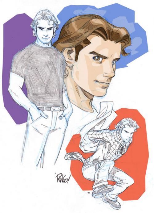
As you’ve no doubt heard by now, Peter David will be the writer of the new SPIDER-MAN comic– and the book also has a name: FRIENDLY NEIGHBORHOOD SPIDER-MAN. I think the name is a great one, implying lots of fun, and I’m sure Peter’s stories will embody that spirit. The guys at WIZARD magazine were interested in using the sketch art for Peter I did several posts back for a piece about the book in an upcoming issue, but I really didn’t like that initial take– so I did something else that would (at least in MY eyes) look better. It’s got a similar element in it with Peter jumping and changing into his SM suit– but I also added a little color to the sketch to jazz it up.

parkerwizard.jpg

OK– that’s it for today.

Mike

More SPIDER-MAN play…

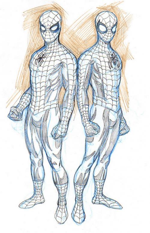
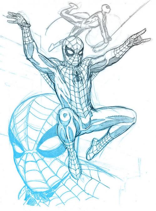
Well, that last post prompted quite the spirited discussion afterwards in the comments section, I have to say– which was a lot of fun to read! It was incredibly cool to have Jeff Campbell drop in and add his perspective on the whole situation– and to read the back and forth that came with all of it. I’d love to discuss this kind of thing with you at length, Jeff– but your site doesn’t have an email function on it! If you happen to stop in again and see this particular post– if you’d be interested, I’d love for you to go to the contact page and send me your email so we can delve further into the subject. I’d love to continue to pick your brain about it. I thought for today’s post, I’d try a side-by-side comparison with the way I’ve been drawing SPIDER-MAN lately with a version of the way I drew him when I was working on SENSATIONAL. More of a ‘thinking out loud on paper’ kind of thing. I’m still very torn between fighting my natural instincts to draw him in a more traditional manner and trying to go wild and put my own stamp on him by, as Jeff put it, ‘dusting it off and tweaking it here and there’. I’m not all that worried about it– this is the fun part of the process anyway– coming up with a personal take. I’m just glad I’ve got the luxury of time to actually PLAY with it, like I did on FANTASTIC FOUR. Of course, the way I drew the FOUR was quite different from the time I started to the time I finished my run. That’s the way it is with everything I do. It’s just what happens– so really, anything I come up with will more than likely mutate organically over the months anyway.

spideysketchiib.jpg

Does whatever a spider can….

On my first run on a SPIDER-MAN book– called SENSATIONAL SPIDER-MAN– I tended to draw the character in a much different way than the way I draw him now. Previously, I gave him a pretty big head, long skinny neck, gangly limbs, REALLY big eyes on his mask– and most of all, enormous feet. I guess I was trying to put my own ‘personal stamp’ on the visual history of the character. I’d be lying if I said that there weren’t more than a few long-time SPIDER-MAN fans who were pretty unhappy with the way I drew him at the time. Maybe it was residual backlash left over from the McFarlane days, or maybe it was just the cartoony aspect of my work– but some of the criticism rubbed off on me. In my last couple of issues, I really bulked my SPIDER-MAN up, gave him a bigger neck, wider shoulders and narrow hips. This caused several folks to ask why I’d done THAT. It was just in an attempt to please everyone. I’ve since come to realize that pleasing everyone is pretty much impossible.

The two issue SPIDER SENSE story in FANTASTIC FOUR Mark and I did last year gave me the chance to re-visit the character. And I was a little surprised to find that my take on him had become quite a bit more… traditional…. than my previous take. Maybe it’s that I’m getting older and more nostalgic for the old Silver Age stuff– I don’t know. But the way I draw him now is much more John Romita and Steve Ditko than Todd McFarlane and Mark Bagley. It’s funny that I did this sketch this morning — because just by coincidence, my buddy Jeff Parker has a post about (and a sneak peek at the art for) an upcoming issue of SPIDER-MAN ADVENTURES he wrote that was drawn by a fellow named Patrick Sherberger. It looks like a winning combo!

spideysketch.jpg

Mike

This and that

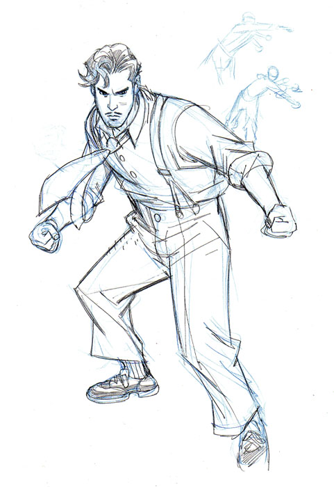
No real theme for today’s post. I thought I’d just put up a few random items from my piles of sketches– things I’ve done on the spur of the moment– warm-ups or designs that I’ve used for some of my comic projects. The first one is a sketch of an Alex Toth character– it may be the only character he ever created for HIMSELF– for a series called BRAVO FOR ADVENTURE. It didn’t turn out quite as well as I’d hoped, so my original attempt to add it to an Alex Toth thread on THEDRAWINGBOARD.ORG was aborted. But what the heck, I don’t mind showing it…..

<

bravo.jpg

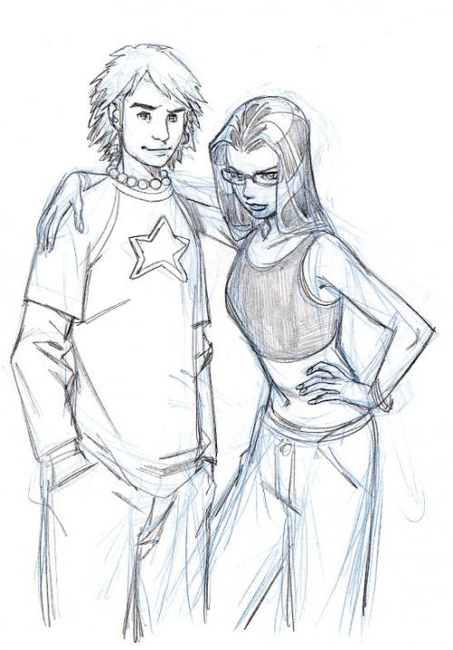
The second is just a sketch of a young couple. I try to keep up with what young folks are wearing and the kinds of hairstyles they have in an attempt to keep ‘current’ with modern looks. I never want to get caught in that odd loop that so many comic book artists had in the 90’s where their idea of ‘cutting edge’ was to give everyone green mohawks and lots of chains– something that had gone out of fashion a decade pervious. Heck, THIS will probably look dated in a few years, the way fashion trends constantly evolve…..

couple.jpg

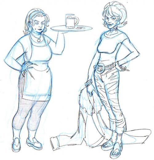
And finally, here’s a couple of ladies I designed for a bar scene that was set in Ben Grimm’s old Yancy Street neighborhood in the beginning of FANTASTIC FOUR #523. The idea was to make the characters in the bar as scruffy and seedy as possible. I really liked the way these ladies turned out in my sketches– but I couldn’t make them quite as run-down looking in the actual pages for some reason…

barfolk.jpg

OK– that’s it for today.

Mike

FUTURE WARS….!

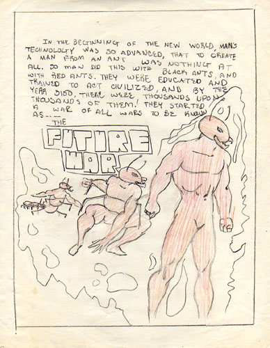
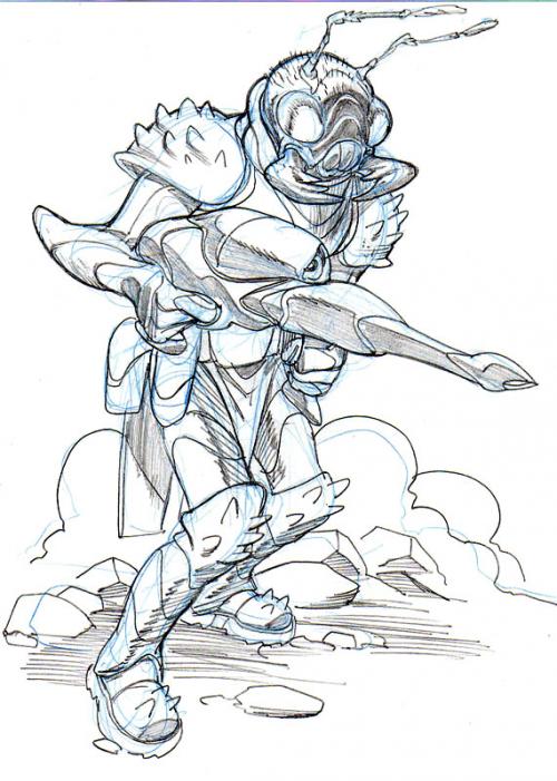
And now for something completely different from the ‘Childhood Files’: FUTURE WARS! As a kid, almost every kind of genre caught my fancy when it came to comics. Above all, I loved the superhero fare– but I also loved to dream up concepts for fantasy and science fiction stories as well. One of those science fiction ‘concepts’ I called FUTURE WARS. The story revolved around scientists working some sort of mojo to create an ant/human hybrid– or something like that. They manipulated/evolved ants into humanoid creatures, at any rate. WHY they would want to do this is beyond me now, but I must have had a rationale for it then. Of course, after spawning thousands of these new creatures, naturally the ant creatures decide to take over our world and subjugate humanity. After all, what good ‘monster of science’ story doesn’t have the ‘monster’ eventually trying to overthrow its master…? And so, humanity fights back, and thus begins the FUTURE WARS (sheesh– what a silly title_). Looking at it now– what I came up with is a variation on PLANET OF THE APES, really. Oh, well— so much for originality.

My folks were amazingly encouraging about my desire to pursue an art career. I’ve read so many stories from comic book artists about their beginnings in the field that revolve around how their parents were fearful of their ability to make a living doing what they loved. The exact opposite was true of my own parents. And when I drew this FUTURE WARS picture all those years ago– for some reason, my dad fixated on this idea, and thought it was something that I HAD to pursue! He constantly encouraged me to work up a complete story with this idea and begin submitting it to magazines like HEAVY METAL. He was always doing that– bringing home comic magazines (lots of those old black and white EERIE and CREEPY rip-offs the names of which escape me at the moment) and tossing them down to me as I lay on the floor of the living room, drawing. “You’re a hell of a lot better than these artists, Mike– you really aught to send them a submission.” he’d say. He was of course WRONG– even as bad as those artists were, they were still leagues ahead of my meager 13 year old ‘skills’– but it was stunning and sweet that he’d be so utterly encouraging like that. I never DID do anything with FUTURE WARS– but my dad instituted a running joke over the years that always began “Hey– do you know what would make for a great comic….?” And I’d always fall for it and say “No– what?” “Well, it’s this story about these ants, see– and these scientists evolve them into humanoids….” And I’d realize the joke and go “AWWWWW, Dad….!”

I’d fall for it every time. I think the last time he did that was just a couple of years ago.

Mike

futurewars1.jpg

futurewars2.jpg