CLASSIC….

⊆ April 17th, 2006 by ringo | ˜ Comments Off on CLASSIC….

spidermanillo.jpg

You know what I miss already….? SPIDER-MAN’s classic costume– that’s what. It’s such a timeless and brilliant design– it’s no wonder that there’s never been a permanent change from the original. It’s hard to imagine ANYONE coming up with something that could replace forever the original design… something that would stand the test of time as SPIDER-MAN’s first design has. I remember the black/symbiote costume was a nice change of pace for a while– and lasted for quite some time before the original came back. From my point of view as an artist on a SPIDER-MAN title– and as a fan of the character– I can only hope that the present diversion from this wonderful original costume is a very brief one. I’ve had a lot of folks ask me over the years if it’s difficult drawing the webs on SPIDER-MAN’s duds… if it ever gets tedious or frustrating to have to draw them all the time. The funny thing is, after a while, they become second nature. And the webs have a wonderful way of helping to define the form… they actually help provide or add to the illusion of dimensionality to any drawing of the character. So, as I always say to those who ask…. no, it’s not frustrating. It almost becomes a zen thing. It’s fun to watch the form grow out of the lines that make up the webbing on SPIDER-MAN’s costume.

Come back soon, classic SPIDER-MAN…. come back soon.

This is Entry 216.

Mike

Another unused FRIENDLY cover sketch…

⊆ April 12th, 2006 by ringo | ˜ Comments Off on Another unused FRIENDLY cover sketch…


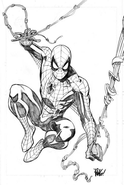
This sketch is one that I did for the cover to FRIENDLY NEIGHBORHOOD SPIDER-MAN #9. I was told that it was Peter David’s idea to have an homage cover to the famous cover from AMAZING SPIDER-MAN #39 drawn by the legendary John Romita, Sr. Homage covers seem to be very much the rage these days at Marvel– as evidenced by the covers done for the MARVEL ZOMBIES miniseries painted by Arthur Suydam. I think they are wonderfully done and very bizarre in their reinterpretations of classic Marvel covers…. but with all the characters being zombies. On a personal level, there’s nothing more….. uncreative, I suppose is the word, than to draw a cover based on something that’s already been done. It feels like having to shut down my imagination and sense of creativity intentionally in order to redraw something that someone else has already drawn. But– I try to be a good soldier, and so I did my duty and worked up this sketch. As it turns out, once the sketch was finished and submitted, the editorial folks decided that a different angle that might be a bit more exciting and modern was called for, and that’s what became the final cover to FRIENDLY #9. But I though, since so many folks enjoyed seeing the last unused sketch, I’d show folks another.

I will probably do the same thing for issue #10– once the actual art/solicitation sees print. I don’t want to jump the gun and get in trouble.

This is Entry 215.

Mike


STRANGE DOINGS or "How The Heck Did This Happen…?!?!?"

⊆ April 10th, 2006 by ringo | ˜ Comments Off on STRANGE DOINGS or "How The Heck Did This Happen…?!?!?"

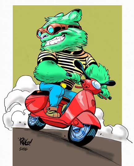
vespacolor.jpg

When I was a kid, and I would sit down to sketch (well, LAY down, really– I almost always used to draw laying on the floor on my stomach), my mind would be so filled with images and thoughts that I would just draw whatever happened to come to mind the quickest– whichever idea/thought/image could elbow its way to the head of the line would be the first on the page. I never seemed to have enough time– or paper and pencil– to get what was jostling around in my head on the page. These days, it’s different. I don’t know what the exact reason is– but lately, when I sit down to sketch something out, I have to have a pretty concrete idea in my mind of what I want to draw before getting started. If I don’t have something in mind…. I can sit there and stare at the blank piece of paper for minutes– or even an hour– before something comes to me. Maybe that’s because as I’ve gotten older, my imagination has dulled (I don’t really think that’s the case)– or maybe it’s because I’ve been working on full scripts from other writers for so long that the part of my brain that comes up with its own ideas/imagery is like a muscle that hasn’t gotten any exercise in a very long time…. weak and flaccid. Before you think I’m feeling sorry for myself–don’t. I get paid to draw for a living. It doesn’t get any better than that.

I tell you that because today’s sketch ended up coming as quite a surprise to me. To set it up– I had seen a sketch someone did on one of the many art forums I frequent. It was of a woman sitting on a scooter. To be honest, it wasn’t the most well drawn sketch I’d ever seen, but it made me want to do something similar– to draw my own ‘babe on a motorscooter’. And so I turned around to my drawing table, pulled out a piece of paper, started sketching…. and what came out was not a WOMAN on a scooter/vespa. As I started drawing, the image of some strange creature that was like something out of MONSTERS, INC. popped into my head, and so instead of a long legged woman, the creature you see in the finish today formed. Even the colors (which are rather ham-handed, admittedly) suggested themselves to my mind as I was drawing. I have to say that it was a fun and wonderful experience that really took me back. I hope it won’t be the last time something unexpected like this happens.

This is Entry 214.

Mike


Unused FRIENDLY cover sketch

⊆ April 7th, 2006 by ringo | ˜ Comments Off on Unused FRIENDLY cover sketch


This is a sketch I did for the cover to FRIENDLY NEIGHBORHOOD SPIDER-MAN #5 that was ultimately rejected. My idea was to create a montage that would encompass more of a concrete idea of what the story was about… and to show a bit of good old SPIDER-MAN action pitting him against THE VULTURE– which was one of the scenes that took place in the comic. I really enjoy the montage idea for covers because it’s a more fun exercise in composition and juggling the various elements that end up included in the mix. Ultimately, the editors decided that they wanted SPIDER-MAN to look more menacing to the Vanna character, which is how she viewed him in the story. I thought it would be fun to share a ‘behind the scenes’ rejected cover idea with you.

Have a great weekend.

This is Entry 213.

Mike


SCARLET Wednesday…

⊆ April 5th, 2006 by ringo | ˜ Comments Off on SCARLET Wednesday…

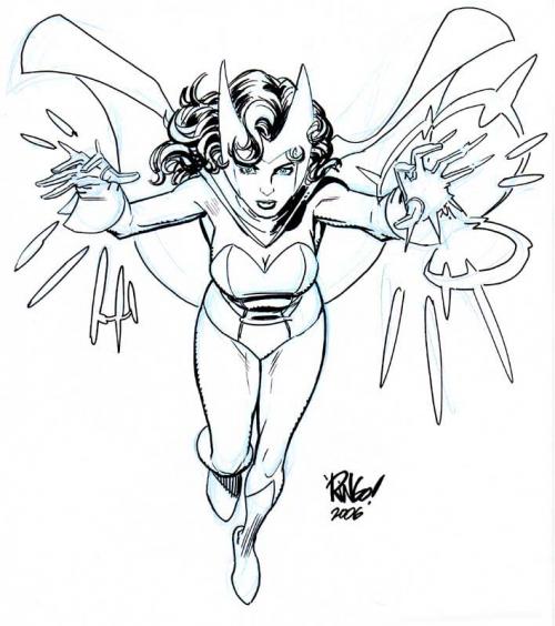
scarletwitch.jpg

There’s another great drawing jam over at DRAWINGBOARD.ORG— this time featuring THE AVENGERS (the MARVEL comics characters… not the old TV show starring Patrick Macnee and Diana Rigg). I always loved Wanda, the SCARLET WITCH character, so I did a sketch of her for the jam– and thought I’d post it here for you to see –although you should also follow the link and check out all the wonderful stuff done in the thread… lots of very cool stuff to see there. Not much by way of brush-pen used this time…. the sketch is mostly inked with a Pigma Fountain Pentel made in Japan. It’s got a very flexible plastic nib at the point that allows you to get a variety of thick-to-thin lines that can emulate a brush if you use it that way. Unfortunately, the tip tends to wear down quickly after not that many uses. I love the pen– and haven’t been able to find them online for quite some time. I don’t know if they still make them or not. I’ve only got about 10 of them or so left… so I use them sparingly these days. Brian Stelfreeze originally turned me on to them, so maybe I should give him a shout to see if he knows if they’re still being offered anywhere. Wanda’s hair is done with a Faber-Castell PITT brush pen. I’ve been using that as well as a Pigma brush pen on the previous two sketches. They have permanent india ink in them, so they’re not going to fade, which is a good thing.

That’s it for today.

This is Entry 212.

Mike