SECOND THOUGHTS
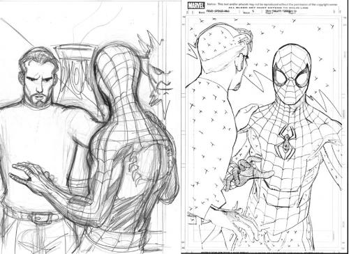
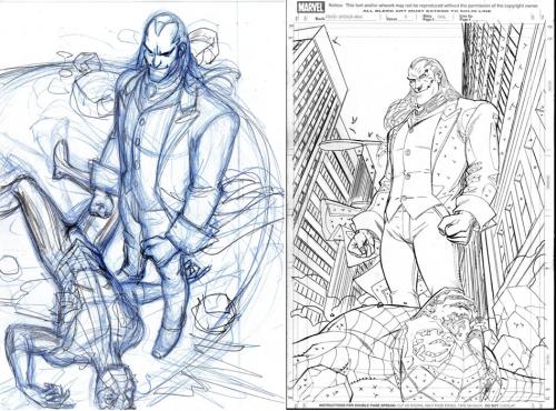
I have a very time-consuming page to work on today to try to get done before the FedEx deadline. I started working out a sketch… but it wasn’t coming out as well as I’d like, so I decided to set it aside and try something else. So for today, I’m going to show you two instances where I did finished layouts for a couple of splash pages during the OTHER crossover story line when I was working on FRIENDLY NEIGHBORHOOD SPIDER-MAN that upon a second look, I decided not to go with.

This first example is from FRIENDLY #2, where DOCTOR STRANGE is telling SPIDER-MAN that he had a terminal illness. My first layout was from behind SPIDER-MAN, showing the concern on the Doctor’s face as he’s forced to break the bad news to his friend. I liked the way it came out, really– but after thinking about it for a while, I thought it might be better to show SPIDER-MAN’s shock at the news instead. With hindsight, the SPIDER-MAN on the finished pages certainly isn’t the best version I’ve ever drawn of the character… I just don’t like the way he came out. Also, the body language in my first version conveys his feelings well enough… so in this instance, I wish I’d gone with my first version.

This second splash is the first page from issue #3. After drawing this, I liked the way it looked… but it felt like something was missing. I think it felt perhaps less dramatic than it could have… and I also thought that it might be a good idea to show some of the surroundings of the setting from which the previous issue left off. I’m always most conscious of trying to make my storytelling as clear as possible. I sent a scan of this layout/sketch to Tom Brevoort– my editor on the book at the time– and he agreed that a more dramatic and comprehensive take on the splash could be done. And so the page on the right is the one I came up with after rethinking the problem. In THIS case, I’m much happier with the second attempt.
OK… gotta get to work.
This is Entry 348.
Mike