Archive for April, 2006

COLOR

defiantcolorcopy.jpg

After I posted the sketch for Wednesday, I decided I wanted to try some quick colors on it…. I figured if I could come up with something that was working for me, I’d keep it. Otherwise, I’d just scrap them, no harm done. That was around 11:30 that morning. By 4 PM, I was just finishing up. I didn’t mean to spend that much time on it…. but once I got started, I guess I got a bit carried away. I STILL don’t have a real grasp of color theory and making all the colors of a piece work together as a coherent piece…. but I think this is one of the most successful (relatively speaking, keep in mind…) of anything I’ve colored so far.

Just a quick one today.

This is Entry 220.

Mike

YACIN MANDRAGON

defiant.jpg

A couple of weeks ago, I posted links to a few blogs that I love checking out on a regular basis. I’ve got another one to tell you about today– featuring a spanish artist named Yacin Mandragon. Yacin’s work is magnificent– there’s so much charm and such a lyrical quality to his drawing and use of color. On his blog, he presents illustrations that deal with a little magical faun– set, I believe, during the medieval era– because he sometimes interacts with the wizard Merlin. These pieces are absolutely wonderful– but if you click through to his profile, and then follow the link to his main website, there’s enough amazing stuff there to keep you busy for an entire afternoon. Yacin’s drawing seems to have a slight japanese influence in his approach as well as his choice of subject matter. There’s an innocence and sense of wonder in his drawings that remind me of Miyazaki quite a bit. His work is infused with light– and looking at Yacin’s pieces, I feel swept away– back to a time of childhood where anything and everything seemed possible and adventure and the unknown was just around the next corner. Yacin also has an amazing array of links to the right of his blog that will keep you busy and fascinated for…. well, for as long as you want them to. The variety and talent of those linked artists is stunning. This, to me, is the best thing about the web… the discovery of so many talented folks who’s work I might otherwise never see.

So go– get lost in imagination.

This is Entry 219.

Mike

FLIGHT 3

spacefriend.jpg

I’m going to have to make it quick today– I’ve got so much to do. However, I don’t want to go before dropping a couple of links on you that you’ve just GOT to check out (unless you’re already up on the news/images). In the past, I’ve gushed about how wonderful I think the FLIGHT anthologies (two volumes out so far) are. Guided/edited by the uber-talented Kazu Kibuishi (check out his link in the sidebar), these books are an amazing display of imagination and creativity. These books are filled with visual delights that I’ve thrilled to for hours upon hours. One of the most amazing things about the talented folks in FLIGHT is that they are, for the most part, web cartoonists. They’ve spent their ‘creative formative years’ plying their talents doing web strips and web illustrations. Not constrained by commercial trends and demands, they’ve developed their art and stories with the boundless freedom that web and self publishing offers. And the results are really stunning.

COMICBOOKRESOURCES.COM has a couple of fantastic articles on the FLIGHT Vol. 3 book to be released this June. The first, you can find here. There’s preview pages from 4 stories there– one by Kazu himself. But the thing that really blew my mind, was the more recent article that give us a look at 13 MORE stories from the anthology. It’s almost overwhelming in it’s visual goodness…! So if you’ve never heard of FLIGHT, or you’ve not seen the preview art from the forthcoming Volume 3– take some time out of your busy day and overdose on some amazing artwork. You’ll be glad you did. And ask your local retailer to order a copy of FLIGHT 3 for you!

This is Entry 218.

Mike

Redesigning the Future

friendly_neighborhood_sm_10.jpg
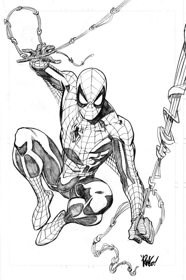
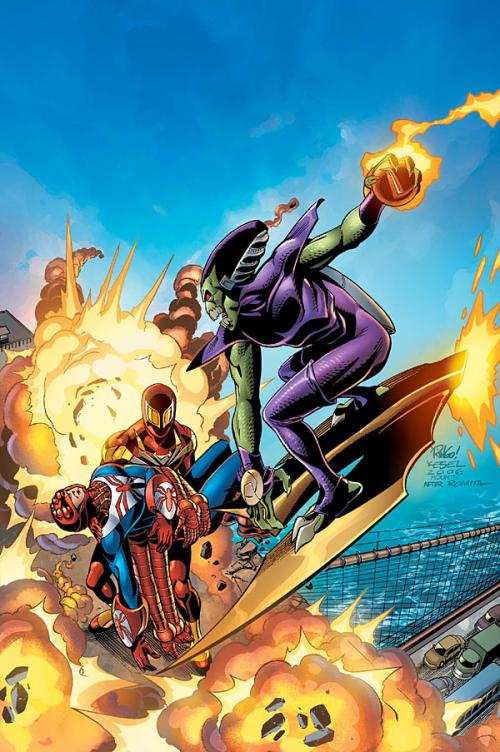
Anyone who’s seen the newly released Marvel solicitations for comics shipping in July will have seen this cover image (IF you perused every image, as I tend to do– if not, this’ll be new to you). It’s the cover to FRIENDLY NEIGHBORHOOD SPIDER-MAN #10… and it’s an homage to the cover from AMAZING SPIDER-MAN #122. You’ll notice that SPIDER-MAN (2006) is holding a limp SPIDER-MAN 2211 in his arms. He’s a character that appeared in just a few panels of a prestige format book from about 15 years back called SPIDER-MAN 2099 MEETS SPIDER-MAN written by Peter David and illustrated by the incredible Rick Leonardi.

This is a shot of SPIDER-MAN 2211 from that original book. Although I’m a HUGE Leonardi fan, I’m not all that enamored with this design for the character. Chances are, since he was a character that only appeared in a few panels of this book, Rick might have designed him on the fly– figuring he might never be seen again. Well– he’s back. And since I wasn’t all that thrilled with his original design– and knew that I’d be drawing him quite a bit for this particular story arc, I asked Marvel if I could redesign him, and they agreed.

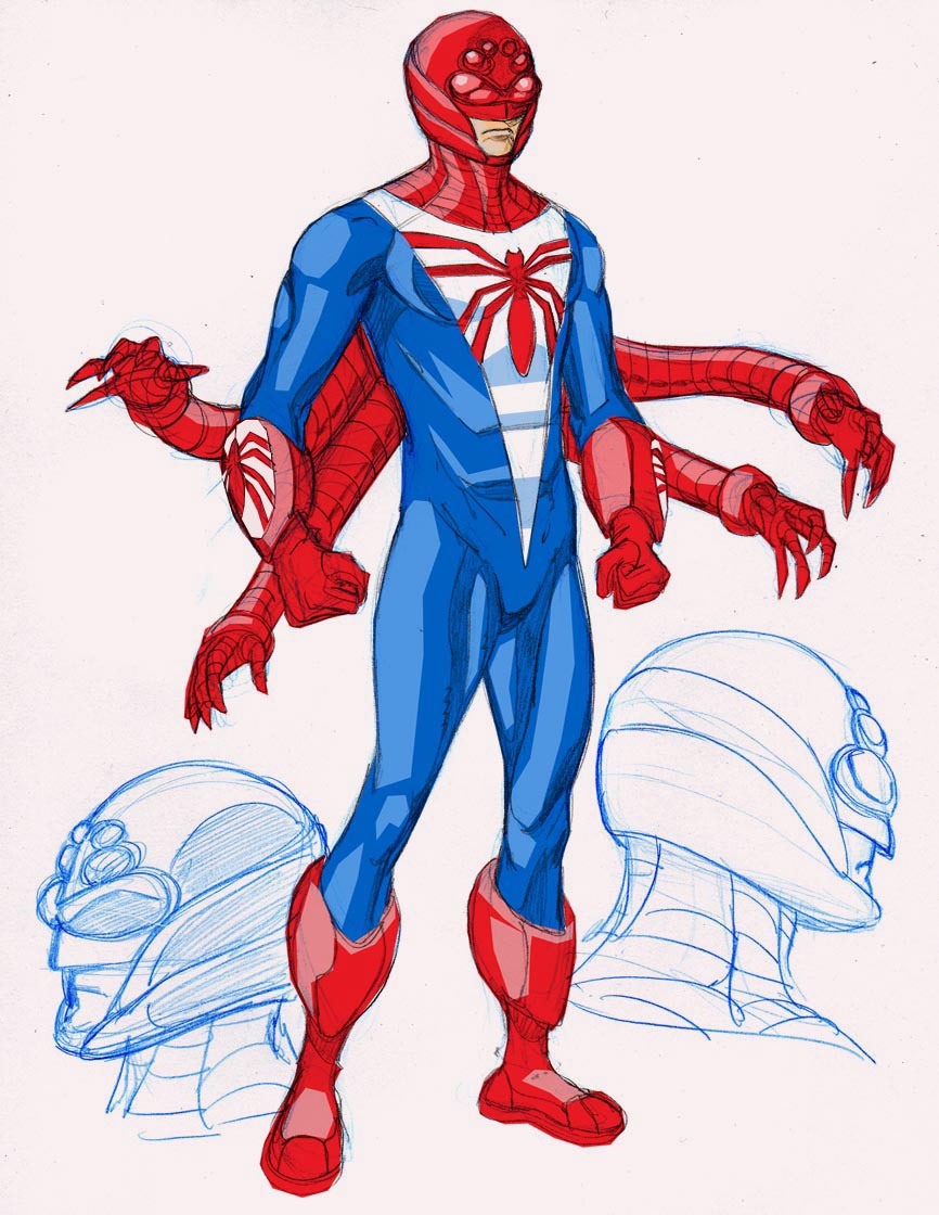
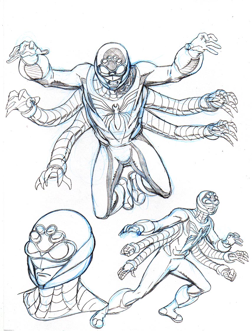
Here’s what I came up with:

spiderman2211.jpg

spiderman2211b.jpg

spiderman2211c.jpg

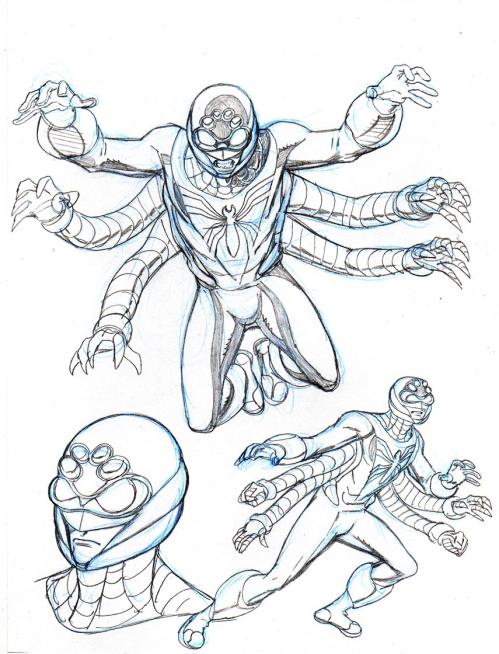
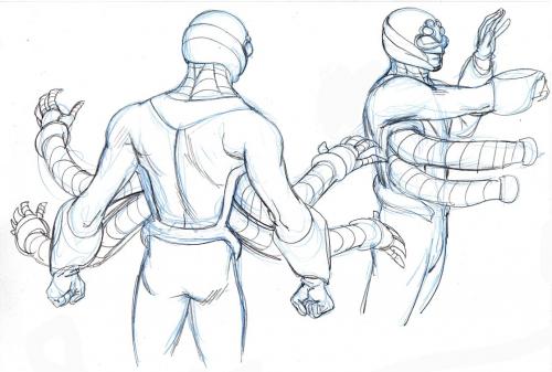
As you can see, it’s not really so much a redesign as a…. streamlining of the character. I like things that are more rounded and fluid when it comes to drawing… and so I wanted SPIDER-MAN 2211’s costume/uniform to reflect that. I made his mechanical arms more reminiscent of DOC OCK’s arms for more easy movement. Imagine actually HAVING 6 arms, with shoulder sockets and elbows to contend with on a normal-length torso, and you can imagine the difficulty of movement– and of trying to DRAW smooth, heroic movement with that impediment. Plus, with the more fluid, OCK-like arms, SM 2211 could slightly stretch and retract them as needed (though not NEARLY as much as DOC….). I also gave his helmet a more spider-like appearance by giving him goggles and adding four more eyes/apertures/sensors above them. And the helmet also gives the impression of spider-mandibles with its new look.

So there you go. YOU decide whether the redesign makes sense or not. It certainly did for me– and made the character much more fun and interesting to draw. This post is pretty image-heavy… so my apologies to those folks on dial-up…..

This is Entry 217.

Mike

CLASSIC….

spidermanillo.jpg

You know what I miss already….? SPIDER-MAN’s classic costume– that’s what. It’s such a timeless and brilliant design– it’s no wonder that there’s never been a permanent change from the original. It’s hard to imagine ANYONE coming up with something that could replace forever the original design… something that would stand the test of time as SPIDER-MAN’s first design has. I remember the black/symbiote costume was a nice change of pace for a while– and lasted for quite some time before the original came back. From my point of view as an artist on a SPIDER-MAN title– and as a fan of the character– I can only hope that the present diversion from this wonderful original costume is a very brief one. I’ve had a lot of folks ask me over the years if it’s difficult drawing the webs on SPIDER-MAN’s duds… if it ever gets tedious or frustrating to have to draw them all the time. The funny thing is, after a while, they become second nature. And the webs have a wonderful way of helping to define the form… they actually help provide or add to the illusion of dimensionality to any drawing of the character. So, as I always say to those who ask…. no, it’s not frustrating. It almost becomes a zen thing. It’s fun to watch the form grow out of the lines that make up the webbing on SPIDER-MAN’s costume.

Come back soon, classic SPIDER-MAN…. come back soon.

This is Entry 216.

Mike